Senra Health
In collaboration with Chalmers Ventures, we developed a visual identity for Senra Health, focusing on creating a balance between clinical trust and a more human, approachable expression.
In collaboration with Chalmers Ventures, we developed a visual identity for Senra Health, focusing on creating a balance between clinical trust and a more human, approachable expression.
Year
2025 - 2026
Type of work
Visual identity
Tools
Figma & Adobe Illustrator
Team
Andrea Kutchoukov, Cornelia Grönroos

Brief
We were tasked with creating a visual identity for Senra Health, a startup developing evidence-based digital tools for people with diabetes, focused on preventing foot ulcers through early risk detection. The goal was to design an identity that feels trustworthy within healthcare, while avoiding a cold or overly technical expression.
We were tasked with creating a visual identity for Senra Health, a startup developing evidence-based digital tools for people with diabetes, focused on preventing foot ulcers through early risk detection. The goal was to design an identity that feels trustworthy within healthcare, while avoiding a cold or overly technical expression.
Solution
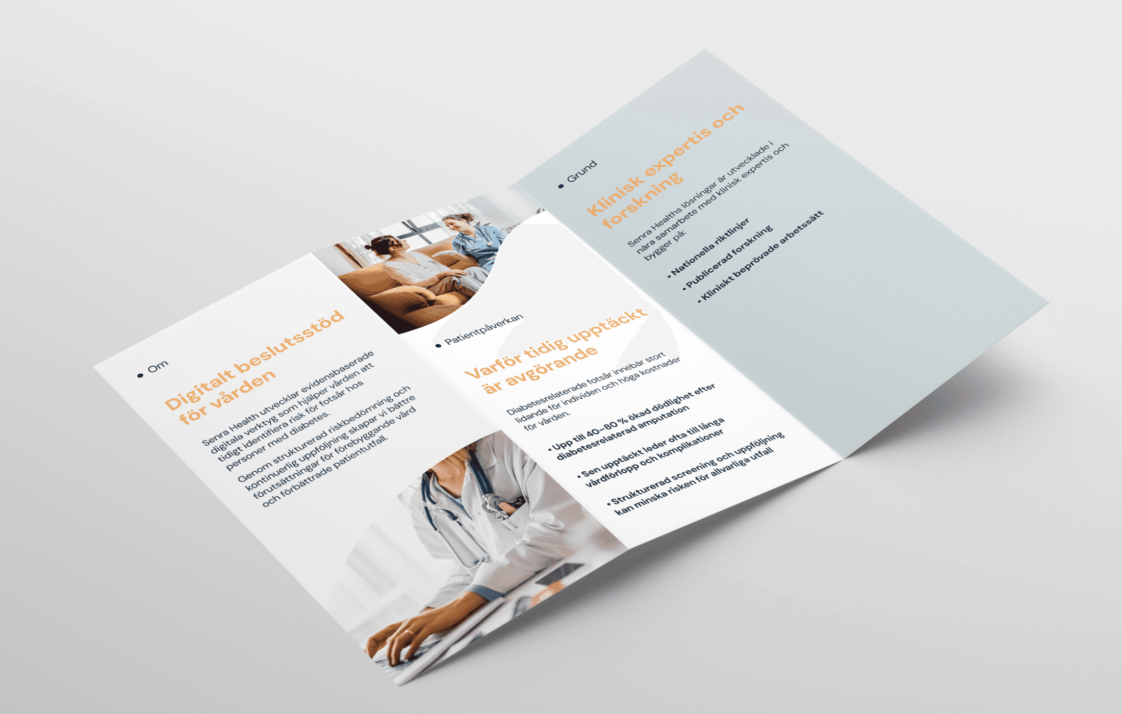
We developed a clean and minimal identity with a softer and more approachable tone. The logo is based on an abstract interpretation of two foot-like shapes, representing the connection between patient self-care and clinical support.
The color palette combines deep and light blues to communicate stability and clarity, with a warm accent color used to guide attention.
We developed a clean and minimal identity with a softer and more approachable tone. The logo is based on an abstract interpretation of two foot-like shapes, representing the connection between patient self-care and clinical support.
The color palette combines deep and light blues to communicate stability and clarity, with a warm accent color used to guide attention.


Process
The process began with research and close collaboration with the client to define tone and direction. Through moodboards and visual explorations, we established a balance between traditional healthcare aesthetics and a more contemporary expression.
The process began with research and close collaboration with the client to define tone and direction. Through moodboards and visual explorations, we established a balance between traditional healthcare aesthetics and a more contemporary expression.
Reflection
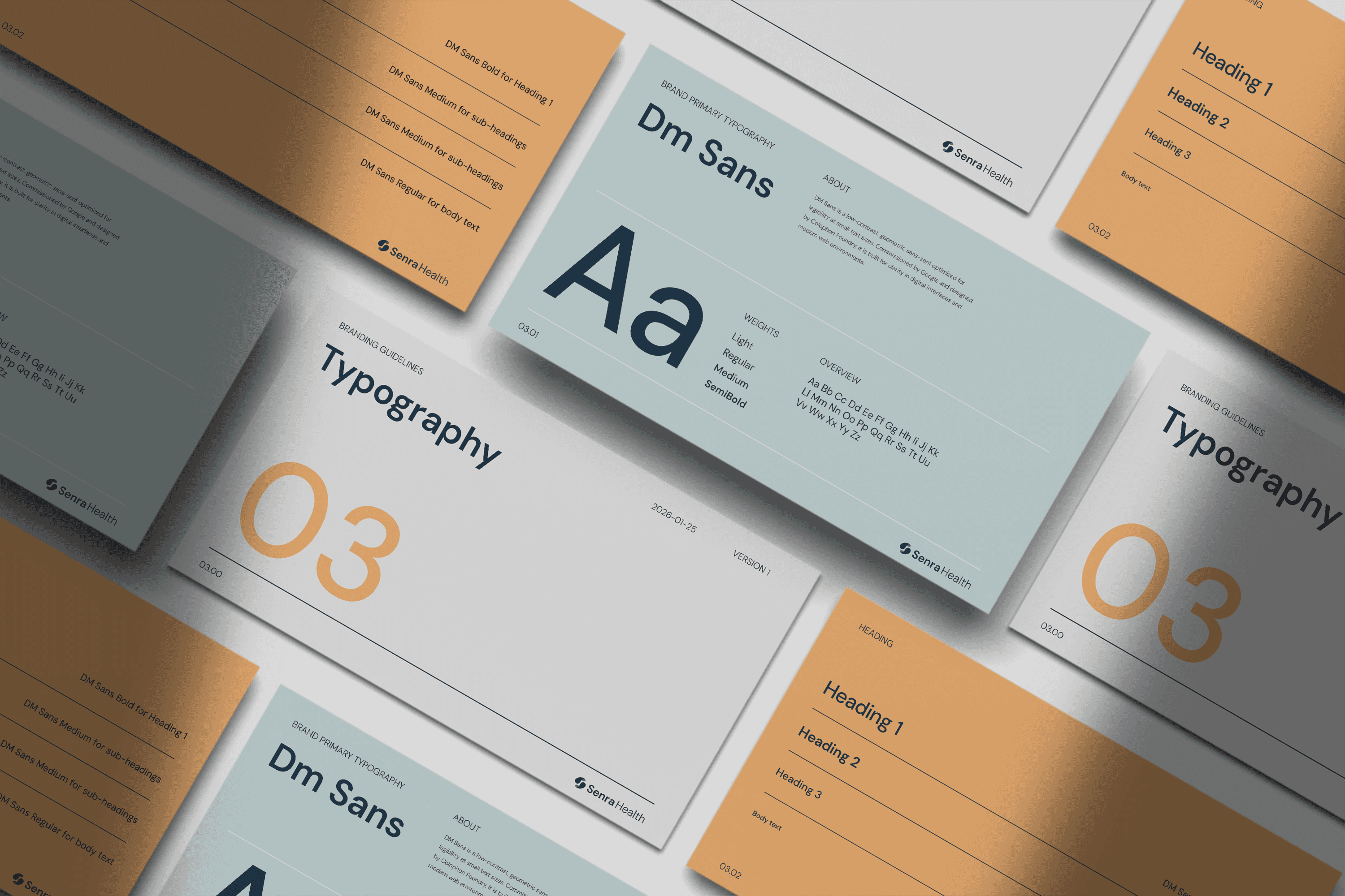
This project highlighted the importance of balance within healthcare design. Creating something that feels both trustworthy and approachable required careful decisions in form, color and typography.
This project highlighted the importance of balance within healthcare design. Creating something that feels both trustworthy and approachable required careful decisions in form, color and typography.